Why We Spent Months on Something We Could’ve Built in Ten Minutes
We just launched the new symmetre.com. Here's the thinking behind it — on design, trust, and why bespoke still beats a template when the people you're trying to reach have seen everything.
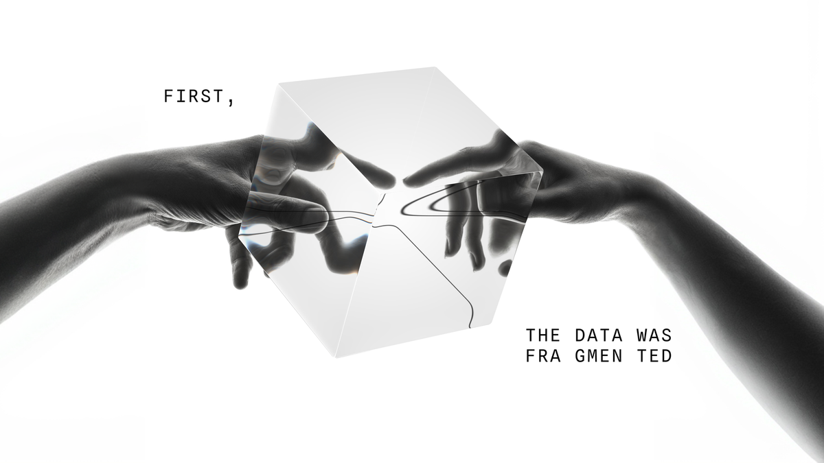
We just launched the new symmetre.com.
It didn't start with a big brief or a brand sprint. It started with a loose directive: "let's revamp the brand," and Kristina Ryndina, our designer, already had a vision before we'd finished the sentence.
That matters more than it sounds. Because in 2026, anyone can generate a decent-looking website relatively quickly. The tools are genuinely that good. Which also means the risk of ending up with something that looks like everyone else's version of "clean and modern" has never been higher.
We didn't want that. Mostly because our clients are making real decisions with partners they intend to trust for years. A template just doesn't carry that kind of weight.
The new site is worth seeing on its own terms (in our humble opinion). But if you have a few minutes, what follows is the thinking behind it. And why that part felt worth writing down.
The design problem was actually a trust problem.
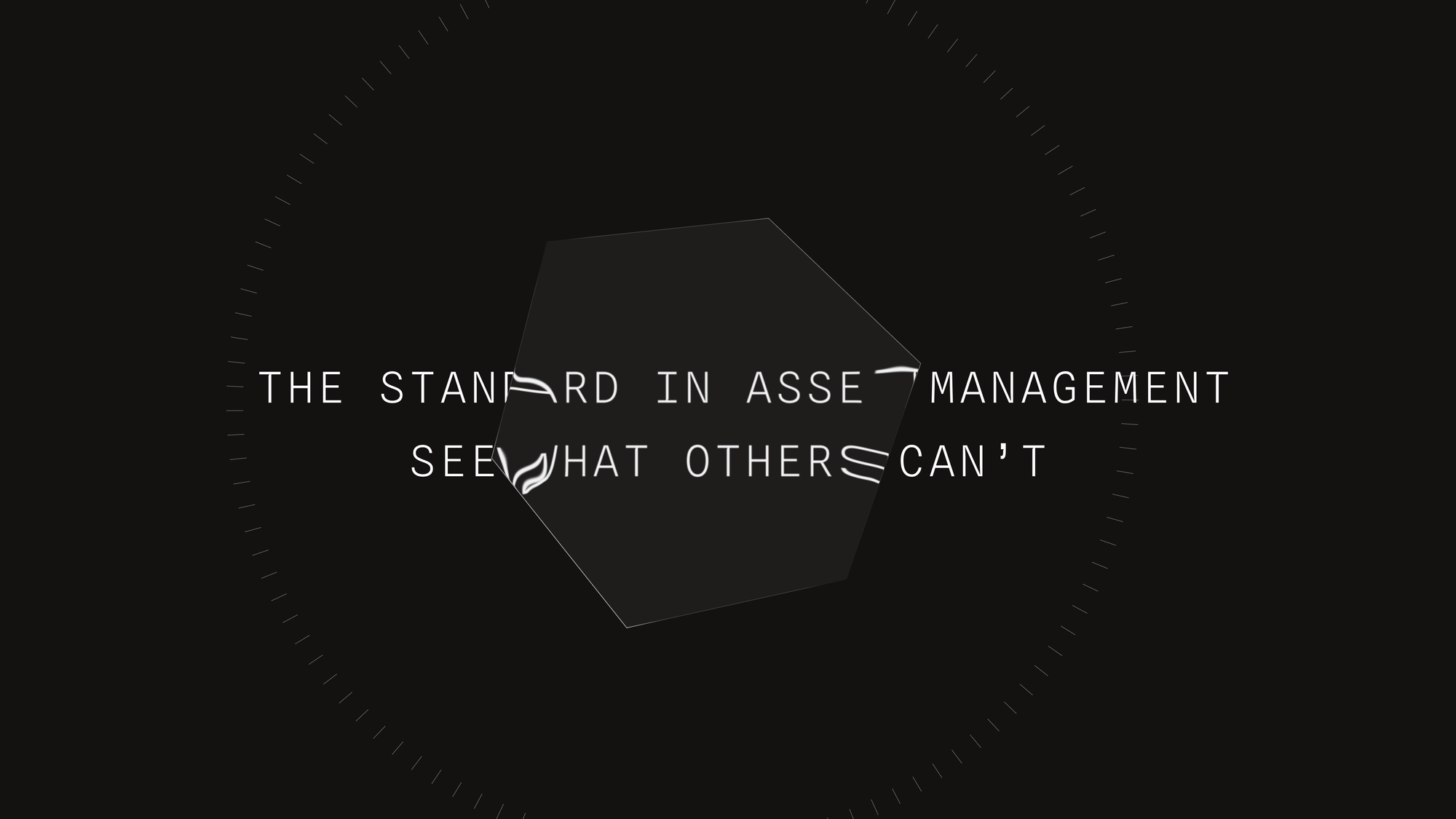
The first thing Kristina identified: this wasn't really a visual challenge. It was a positioning challenge.
"Trust is the most important currency in the RE investment world. If we look too 'techie,' traditional real estate private equity clients might feel we don't belong to them."
So the question became: how do you build a brand identity that feels credibly tech-forward without alienating the institutional clients you're actually serving? How do you signal innovation and stability at the same time? To figure that out, she didn't look purely for visual inspiration. She was hunting for examples of brands that did this better than anyone else.
The website is an obvious place to start. We know this well: a website is a business' calling card. It can make or break your first impression with a client. What are you trying to tell someone? Can you do it in less than 10 seconds?
"When I scan a website, I'm not scanning the visuals alone—I'm scanning the semantic blocks and how the meanings are connected. I want to understand how they build and fill their funnel."
Companies like Linear, Ghost, and V7 Labs made her list—not because of how they look, but because of how clearly they articulate complex information. And how obvious it is that each one is designed around their customer.
Where the symmetRE aesthetic actually comes from.
If this is your first introduction to symmetRE — hello. We provide a software solution for real estate owners & asset management teams: a platform that brings together clean, portfolio data, reporting, and analytics in one place. Our clients are managing complexity at scale, making high-stakes decisions from a lot of moving pieces.
That's the thing about data: it doesn't tell you anything until you know how to look at it.
Which is exactly where the visual concept started. A metaphor.
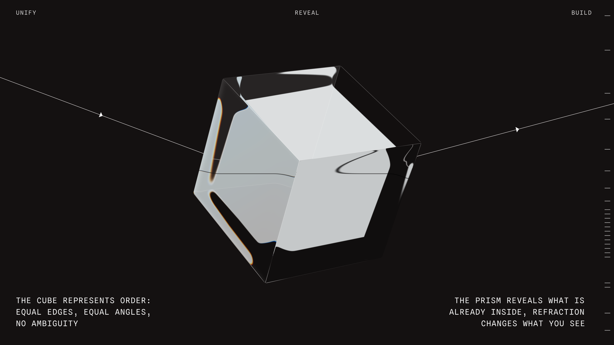
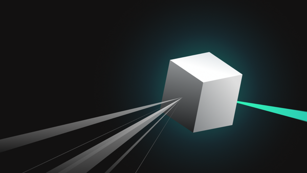
"Knowledge is like a cube. You can build with cubes—layer them, combine them. But knowledge also refracts. It creates different insights depending on the angle,” says Kris.
Glass. Refraction. Clarity with depth. It's not coincidental that this mirrors what the platform actually does. The logo hasn't changed — it didn't need to. It was already anchoring the right idea. Kris just had a larger vision for it and the redesign reimagined a full visual language around it: typefaces that feel precise without being cold, motion that's purposeful rather than decorative, a color palette that reads as financial without feeling dated.
The message and the aesthetic aren't two separate things on this site. They're the same thing, expressed differently.
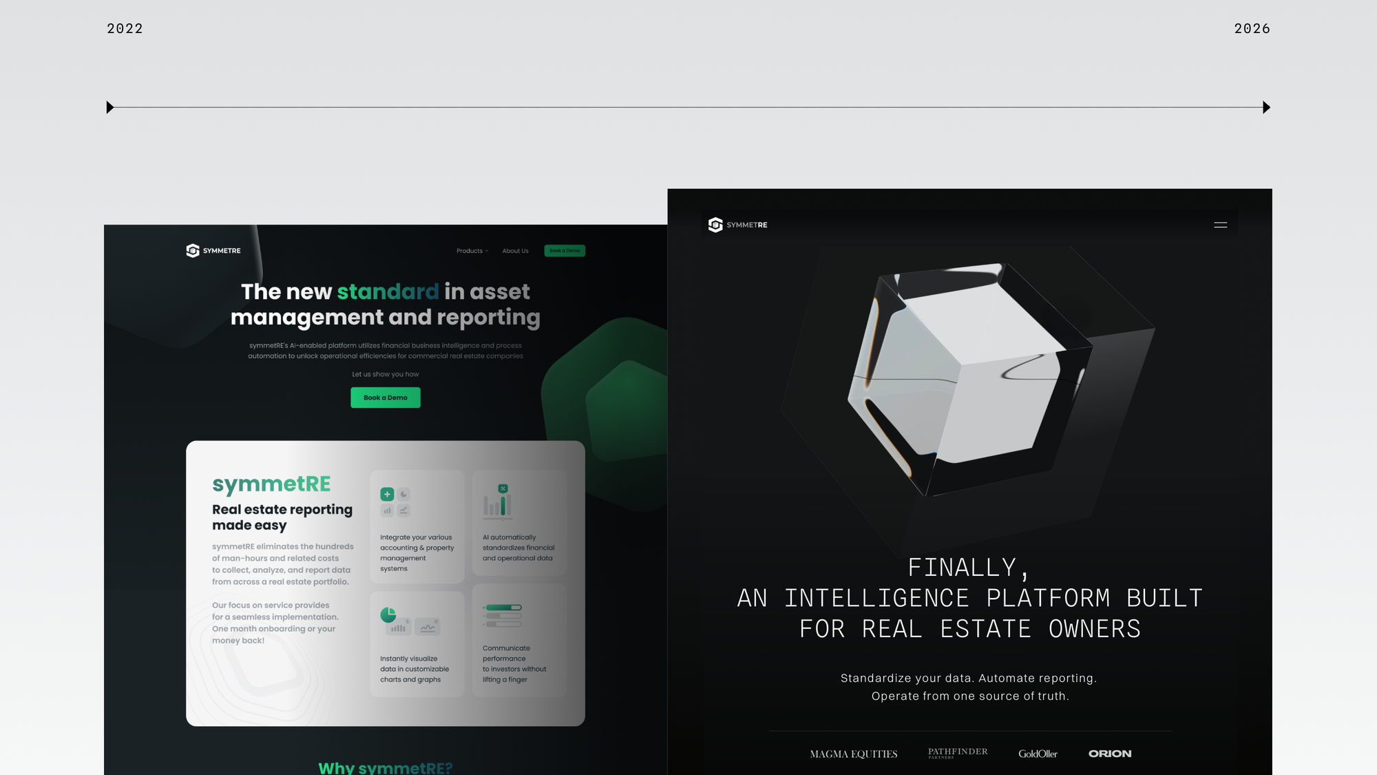
On efficiency — and where it actually belongs.
Yes. We could have shipped a page with buttons and blocks, a clean template, and a working CTA. That works. Plenty of companies do exactly that.
But there's a question worth asking right now, when the temptation to build fast has never been greater: where does efficiency actually serve you, and where does it start costing you something you can't get back?
For us, that question shows up everywhere — not just in the brand. Our onboarding isn't two weeks and a PDF. Our approach to client data isn't to staple it together and call it good. That takes longer and requires more effort. But there's a reason we're built that way. symmetRE is more partnership than platform. That ethos has to come through in every layer of how we show up. Including this one.
We know you have options. This is how we choose to show up.
If love is in the details — and we think it is — then you're going to love this. There's more here than you'll catch in one pass.
Explore the new symmetre.com.